When it comes to web design, there are several important design principles to consider. These include Emphasis, Balance and Alignment, Contrast, Repetition, Proportion, Movement, and White Space. Understanding these basics can make a big difference in creating a website that truly impresses users. It’s highly recommended to collaborate with an experienced expert who has a deep understanding of these fundamental principles. This can take your website to new heights and ensure that it has an eye-catching and user-friendly interface that will impress visitors and keep them engaged. With the help of a professional who has a wealth of knowledge in this area, you can be confident that your site will be optimized to its fullest potential.
If you’re a seasoned or new web designer or simply want to learn more about the field before hiring someone, this guide is the perfect resource for understanding the principles behind effective web design. We’ll examine each principle, provide concrete examples, and offer practical advice to ensure your website is both visually appealing and optimized for accessibility and user experience.
After exploring the 7 Design Principles used in Web Design, read more to discover the benefits of hiring an Orlando web designer for an accessible, strategic, and visually captivating online presence.
1. Emphasis
Attracting the User’s Attention
Getting the user’s attention is important. Different audiences have different needs, so it’s important to consider who you are trying to reach. Start with the most important information and keep sentences short and direct. Use familiar language and an active voice to increase clarity.InsertRephrase.
Emphasis on website design and building is akin to the star on the stage. Emphasis is your secret weapon for drawing users’ eyes to essential elements. It’s how you make certain elements, such as headlines or critical messages, stand out in a sea of content.

Example: Use bold and contrasting colors for your call-to-action buttons on a website offering various services. This immediately grabs the user’s attention, making it clear where to click to take the next step.
2. Balance and Alignment
The Foundation for Visual Harmony
Following balance and alignment principles is important to create a good-looking website. These principles help ensure everything is visually pleasing and in the right place. These two components work together harmoniously to establish a sense of equilibrium and structure in your design. Balance is pivotal in preventing your website from appearing disorganized or chaotic. It involves arranging elements to feel visually balanced and appealing to the eye. Alignment, on the other hand, lays the foundation for your website’s layout.
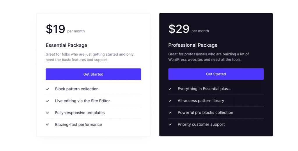
Example: When designing an e-commerce website, ensure that product categories and filters are evenly distributed across the page. By using symmetrical alignment for your logo and navigation menu, you establish a foundation of balance that guides users effortlessly.
3. Contrast
Making things stand out
Contrast is the spotlight that illuminates specific elements, making them stand out by emphasizing their differences. It’s an essential tool in your web design arsenal. The contrast in website design is about making certain elements stand out by emphasizing their differences. Contrast can guide users’ attention and make your content pop when used effectively.
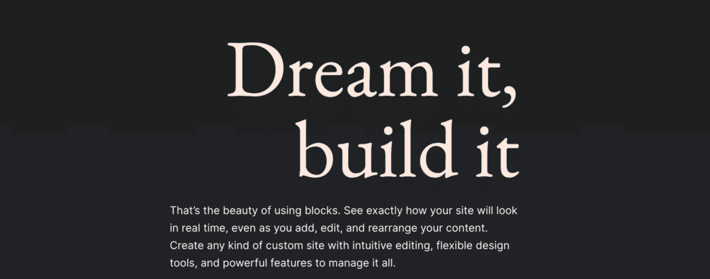
Example: Imagine you’re curating a blog page; employ contrasting colors for your featured articles’ headlines to make them pop against the background. A vibrant, complementary color choice for these headlines immediately draws the user’s eyes and encourages clicks.
4. Repetition
Consistent Brand Identity
Repetition is the thread that weaves your website’s elements into a cohesive visual brand identity. Repetition involves using consistent patterns or elements throughout your design. Repetition is the thread that ties your entire website together and reinforces your visual brand.
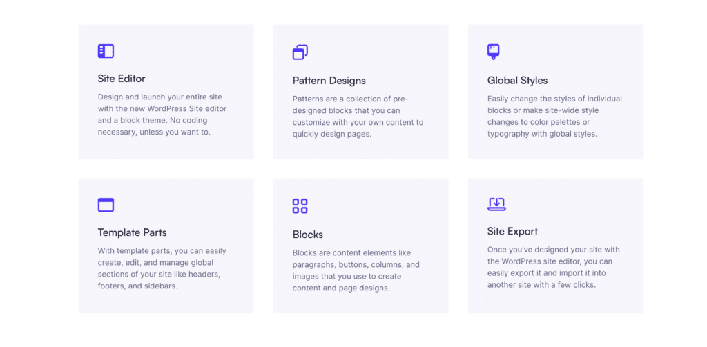
Example: For a corporate website, maintain uniformity in using the company’s logo, color palette, and fonts across all pages. This repetition reinforces your brand identity and makes your website recognizable, building trust and familiarity.
5. Proportion
Consistent Visual Hierarchy
Proportion in web design is about keeping elements appropriately sized about one another. It maintains visual consistency across your site. Proportion ensures that elements on your website are appropriately sized in relation to one another. It’s all about maintaining visual harmony across your design.

Example: Using consistent image sizes and margins for project thumbnails on an artist’s portfolio website. This consistency creates an orderly grid that allows users to browse effortlessly. Whether on a desktop or a mobile device, the proportions remain pleasing to the eye.
6. Movement
Engaging User Interaction
Web design movement is about creating a dynamic and engaging user experience. It can be subtle animations, transitions, or interactive elements that guide users through your site.
In a storytelling website, smooth scroll animations guide users through the narrative, bringing the story to life and keeping them engaged.
7. White Space
The Unrecognized Champion of Website Design
Often overlooked but incredibly powerful, white space is the breathing room within your design. It enhances readability, minimizes clutter, and adds sophistication.
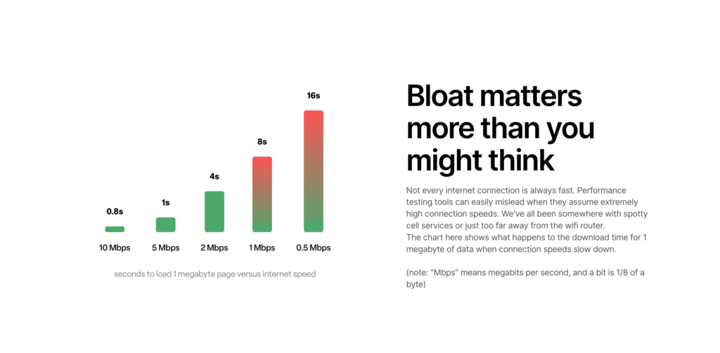
Example: In a minimalist fashion e-commerce website, use generous white space around product images and descriptions. This draws attention to the products and provides a sense of elegance and simplicity.
The Art and Science of Exceptional Web Design
Mastering these seven design principles is the key to creating websites that look stunning and function seamlessly. It’s not just about aesthetics; it’s about user experience, web accessibility, and adhering to web design best practices.
Incorporating these principles is more than just style; it’s about crafting websites offering immersive, engaging, and unforgettable online experiences. So, let these principles be your guiding light, whether you’re a web designer shaping the digital realm or a business owner seeking to elevate your online presence. In the ever-evolving landscape of website design, they are your compass, toolkit, and secret to crafting websites that leave an indelible mark.
Additional Web Design Resources
To delve deeper into web design principles and best practices to further enhance your website design and user experience skills, explore online guides and design resources dedicated to these essential aspects of web design.
- 20 Web Design Principles Every Business Owner Should Know
- 30 best web design tools and resources to try in 2023
- 15 Web Design Principles for a Customer-Friendly Website
- 20 web design principles to follow
- Web Platform Design Principles
- Seven Web Design Principles for Every Type of Site
- 11 Principles of Design (& How to Use Them)
- 10 Essential Principles of Website Design
Hire an Orlando Web Designer and Elevate Your Online Presence
While understanding the seven principles of website design is essential, sometimes, entrusting the creation of your online presence to a professional is the key to achieving remarkable results. In Orlando, a city known for its vibrant business landscape and thriving digital economy, the role of an Orlando web designer in your company’s success cannot be overstated.
The Web Design Expert in Orlando
An Orlando web designer, well-versed in web design principles, brings a wealth of expertise. They don’t just craft websites; they craft experiences that resonate with your target audience.

Here’s what I can do better than other freelance web designers in Orlando:
Accessible Websites for Inclusivity and Best Practices
Web accessibility is crucial, ensuring that your website is usable by everyone, including those with disabilities. An Orlando web designer can implement accessible design elements, such as alt text for images, keyboard navigation, and proper heading structures. By making your website accessible, you expand your potential audience and align with best practices and legal requirements.
Responsive Design for All Devices
In today’s world where mobile devices are widely used, having a responsive design for your website is necessary. Orlando web designers are experts in developing websites that can adjust effortlessly to different devices, screen sizes, and resolutions. With a responsive website, your content will look and work flawlessly, regardless of whether your audience is using a desktop computer, tablet, or smartphone.
Strategic Approach for Business Growth
It’s important to acknowledge that every business has its own unique qualities, and this is something that a web designer fully understands. They collaborate closely with you to create a personalized, strategic plan that aligns with your company’s goals. Whether it’s designing captivating landing pages or improving user experiences, a skilled web designer in Orlando will ensure that your website is not just visually appealing but also a valuable asset for generating leads.
Why hire a Web Designer locally?
I’m located in Orlando, Florida, and I understand the surrounding areas and what’s happening nearby. When working with a web designer, they must understand your audience and where your business sells.
While understanding the seven principles of design is invaluable, leveraging the expertise of an Orlando web designer can take your online presence to the next level. By partnering with a professional who incorporates these principles into every aspect of your website, you’re not just building a digital storefront but crafting an immersive, accessible, and strategically sound online experience.
If you’re near Orlando and seeking to enhance your company’s digital footprint, consider collaborating with an Orlando web design specialist. Together, you can create a website that creates new opportunities and success for your business.